# CSS3 动画
动画(animation) 是CSS3中具有颠覆性的特征之一,可通过设置多个节点来精确控制一个或一组动画,常用来实现复杂的动画效果。相比较过渡,动画可以实现更多变化,更多控制,连续自动播放等效果。
# 动画的基本使用
制作动画分为两步:①先定义动画;②再使用(调用)动画。
1. 用 keyframes 定义动画(类似定义类选择器)
@keyframes 动画名称 {
   0%{
        width:100px;
   }
   100%{
        width:200px;
   }
}
1
2
3
4
5
6
7
8
2
3
4
5
6
7
8
动画序列
- 0% 是动画的开始,100% 是动画的完成。这样的规则就是动画序列。
- 在 @keyframes 中规定某项 CSS 样式,就能创建由当前样式逐渐改为新样式的动画效果。
- 动画是使元素从一种样式逐渐变化为另一种样式的效果,可以改变任意多的样式任意多的次数。
- 请用百分比来规定变化发生的时间,或用关键词 "from" 和 "to",等同于 0% 和 100%。
2. 元素使用动画
div {
    width: 200px;
    height: 200px;
    background-color: aqua;
    margin: 100px auto;
    /* 调用动画 */
    animation-name: 动画名称;
    /* 持续时间 */
    animation-duration: 持续时间;
}
1
2
3
4
5
6
7
8
9
10
2
3
4
5
6
7
8
9
10
# 动画常用属性
| 属性 | 描述 |
|---|---|
| @keyframes | 规定动画 |
| animation | 所有动画属性的简写属性,除了animation-play-state属性 |
| animation-name | 规定@keyframes动画的名称(必须的) |
| animation-duration | 规定动画完成一个周期所花费的秒或毫秒,默认是0(必须的) |
| animation-timing-function | 规定动画的速度曲线,默认是“ease” |
| animation-delay | 规定动画何时开始,默认是0 |
| animation-iteration-count | 规定动画被播放的次数,默认是1,还有infinite |
| animation-direction | 规定动画是否在下一周期逆向播放,默认是“normal”,alternate逆播放 |
| animation-play-state | 规定动画是否正在运行或暂停。默认是"running",还有"paused" |
| animation-fill-mode | 规定动画结束后状态,保持forwards回到起始backwards |
# 动画简写属性
animation:动画名称 持续时间 运动曲线 何时开始 播放次数 是否反方向 动画起始或者结束的状态;
animation: myfirst 5s linear 2s infinite alternate;
1
- 简写属性里面不包含 animation-play-state
- 暂停动画:
animation-play-state: puased;经常和鼠标经过等其他配合使用 - 想要动画走回来 ,而不是直接跳回来:
animation-direction: alternate; - 盒子动画结束后,停在结束位置:
animation-fill-mode: forwards;
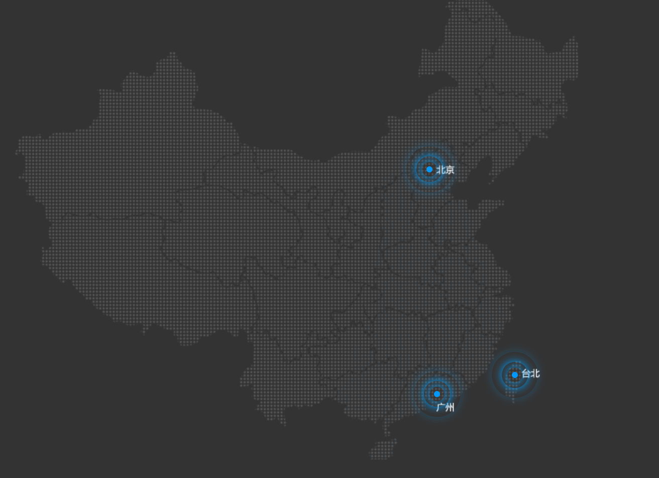
热点图案例
点击查看代码
<!-- 结构 -->
<div class="map">
    <div class="city">
        <div class="dotted">
            <div class="pulse1"></div>
            <div class="pulse2"></div>
            <div class="pulse3"></div>
        </div>
    </div>
    <div class="city tb">
        <div class="dotted">
            <div class="pulse1"></div>
            <div class="pulse2"></div>
            <div class="pulse3"></div>
        </div>
    </div>
    <div class="city gz">
        <div class="dotted">
            <div class="pulse1"></div>
            <div class="pulse2"></div>
            <div class="pulse3"></div>
        </div>
    </div>
</div>
<!-- 样式 -->
<style>
    * {
        margin: 0;
        padding: 0;
    }
    body {
        background-color: #333;
    }
    .map {
        position: relative;
        width: 747px;
        height: 616px;
        background: url(../media/map.png) no-repeat;
        margin: 0 auto;
    }
    .city {
        position: absolute;
        top: 227px;
        right: 193px;
        color: #fff;
    }
    .tb {
        top: 500px;
        right: 80px;
    }
    .gz {
        top: 525px;
        right: 183px;
    }
    .dotted {
        width: 8px;
        height: 8px;
        background-color: #09f;
        border-radius: 50%;
    }
    .city div[class^="pulse"] {
        position: absolute;
        top: 50%;
        left: 50%;
        transform: translate(-50%, -50%);
        width: 8px;
        height: 8px;
        box-shadow: 0 0 12px #009dfd;
        border-radius: 50%;
        animation: pulse 1.2s linear infinite;
    }
    .city div.pulse2 {
        animation-delay: .4s;
    }
    .city div.pulse3 {
        animation-delay: .8s;
    }
    @keyframes pulse {
        0% {}
        70% {
            /* 不要用scale 因为他会让 阴影变大 */
            width: 40px;
            height: 40px;
            opacity: 1;
        }
        100% {
            width: 70px;
            height: 70px;
            opacity: 0;
        }
    }
</style>
1
2
3
4
5
6
7
8
9
10
11
12
13
14
15
16
17
18
19
20
21
22
23
24
25
26
27
28
29
30
31
32
33
34
35
36
37
38
39
40
41
42
43
44
45
46
47
48
49
50
51
52
53
54
55
56
57
58
59
60
61
62
63
64
65
66
67
68
69
70
71
72
73
74
75
76
77
78
79
80
81
82
83
84
85
86
87
88
89
90
91
92
2
3
4
5
6
7
8
9
10
11
12
13
14
15
16
17
18
19
20
21
22
23
24
25
26
27
28
29
30
31
32
33
34
35
36
37
38
39
40
41
42
43
44
45
46
47
48
49
50
51
52
53
54
55
56
57
58
59
60
61
62
63
64
65
66
67
68
69
70
71
72
73
74
75
76
77
78
79
80
81
82
83
84
85
86
87
88
89
90
91
92
# 速度曲线细节
animation-timing-function:规定动画的速度曲线,默认是“ease”
| 值 | 描述 |
|---|---|
| linear | 动画从头到尾的速度是相同的。匀速 |
| ease | 默认。动画以低速开始,然后加快,在结束前变慢。 |
| ease-in | 动画以低速开始。 |
| ease-out | 动画以低速结束。 |
| ease-in-out | 动画以低速开始和结束。 |
| steps() | 指定了时间函数中的间隔数量(步长) |